Last updated - December 19, 2023
In the current era, having an online footprint is of utmost importance whether you own and manage an online business or a conventional brick-and-mortar storefront; and websites are one of the primary ways to have an online presence.
Websites are also one of the most efficient ways to attract your target audience and thus grow your business in leaps and bounds. Since it is the first thing a potential customer is greeted with, it is crucial to have an elegant, practical, and well-put-together website. There are numerous elements that go into creating a highly desirable website, and it would simply be impractical to explain each and every aspect in detail.
Therefore, we have astutely compiled this article that lists the top 8 amazingly designed websites along with a brief analysis of the design concepts map involved. Let’s get started!
Apple
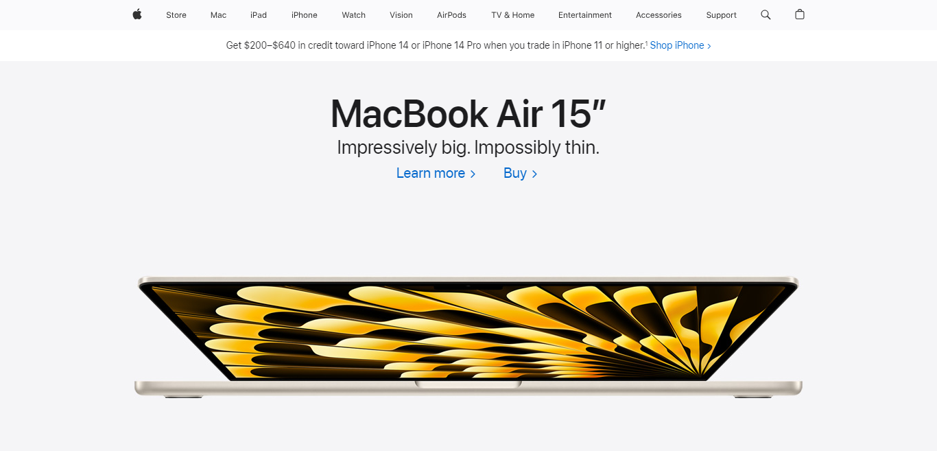
Less is more! This motto holds true for user experience and web design, and Apple has dogmatically followed this principle. Visitors can become confused by crowded subpages, stark contrasts, several CTAs, and an excessive quantity of content, which might result in an unpleasant user experience.
A modern and expert appearance is produced by a straightforward and elegant design. Apple makes use of neutral colors, typefaces, negative space, and white backdrops. Whitespace serves to draw customers’ attention away from things while still having a highly contemporary and streamlined appearance.
Apple’s products and the site’s design and style are both modern. The light san-serif typeface and minimalist hues like white, gray, and black accentuate the contemporary impact.
Stripe
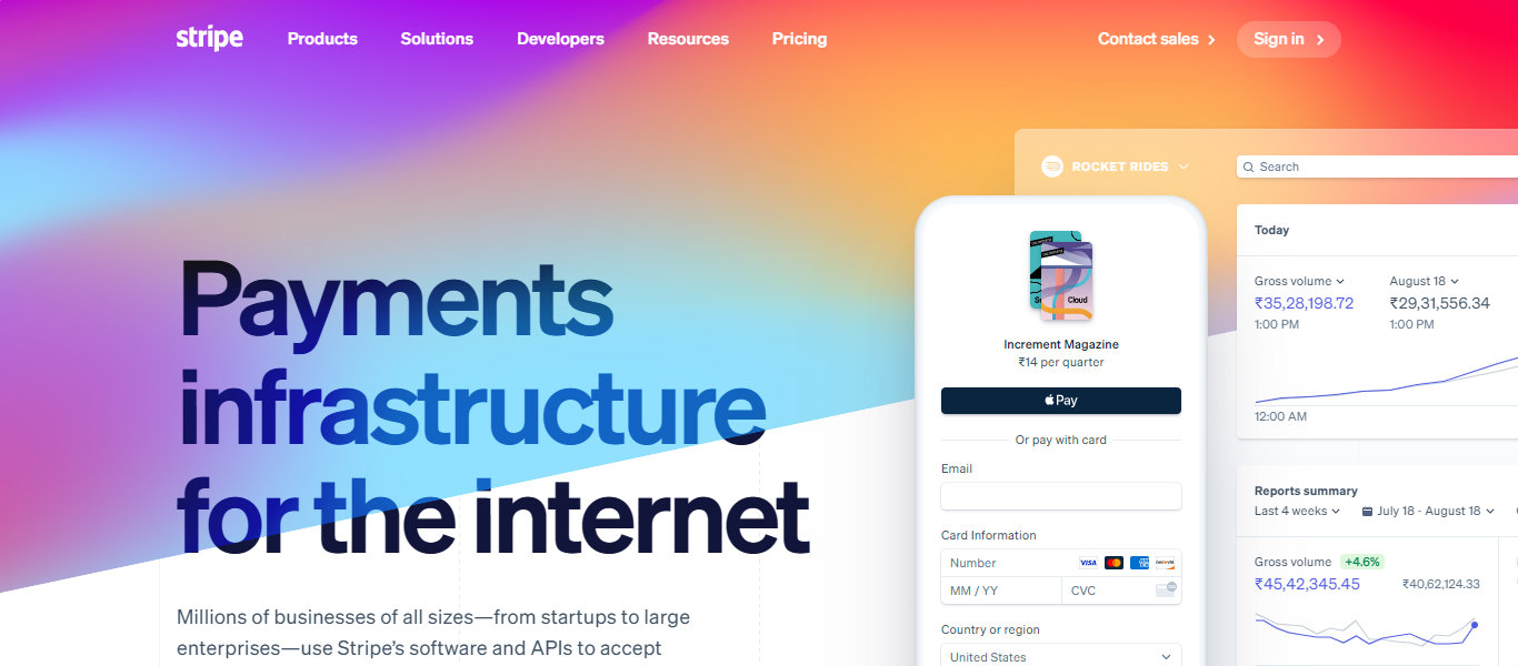
Stripe is a startup that makes it possible for individuals and companies to take payments online and through mobile applications. That doesn’t sound like a business that would have a beautifully designed website, yet take a look at how the company describes itself on the About page — “We think that building an internet business is a problem rooted in code and design, not finance.”
Stripe has created a massive fan following around a single line of code. It has created gradients with such stunning aesthetics that you will want to just copy them. There isn’t anything more tedious to sell than financial services. However, Stripe’s website pushes its uninspiring financial rails in a way that is quite refreshing, extremely professional, and even motivating.
Despite the company’s wide range of items, you will always discover what you need. All choices are simply arranged in a drop-down list and set out by their own visuals and color schemes.
Behance
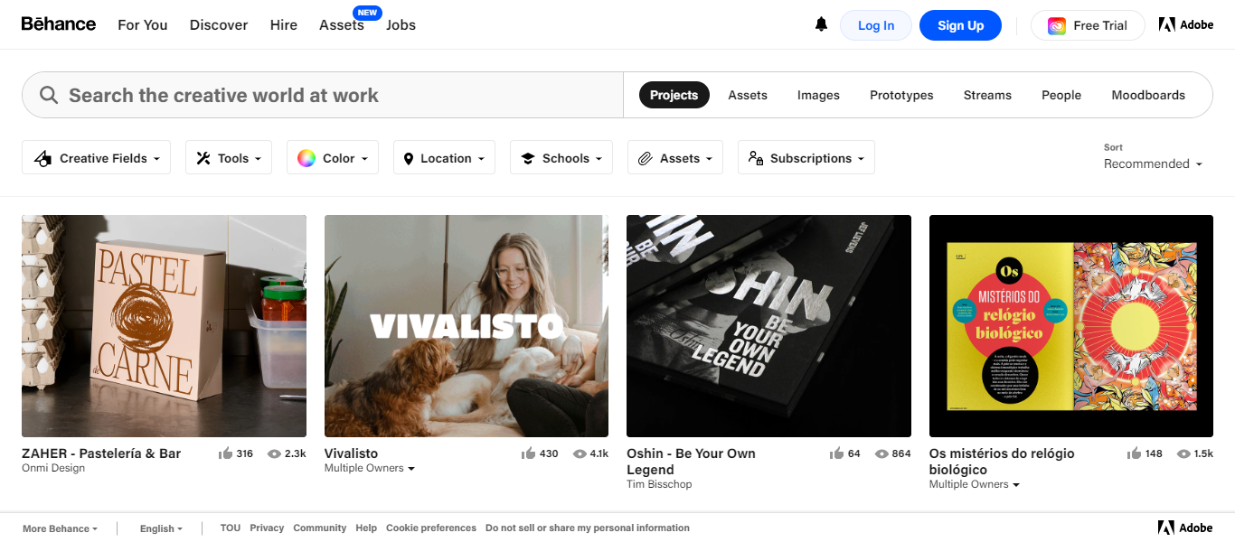
Behance is an Adobe-powered website for all things creative. It is definitely difficult to wrap one’s head around the question “How creative can or should a website on creativity be?”. Why try to understand something so intricate when you can simply see and learn from it?
Having been powered by Adobe, Behance has perfectly balanced visual elegance and practicality. The primary functions are easy to access along with a prominent and long search bar. Also, there are several filters integrated into the search bar that are switchable mid-search. Right below the search bar are several tools that scream ease of access for users.
In short, users do not have to scramble for functionalities when using Behance for their creative requirements.
Zara
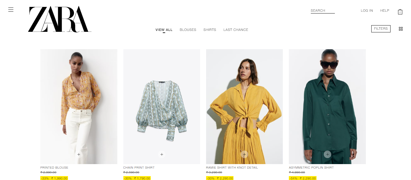
With their unusual product presentation, Zara has used a brilliant marketing strategy to attract attention online. Although some people might find this design language a touch unpleasant, Zara has had success with it.
Yet another unusual aspect of Zara’s website design is that the texts are all in uppercase. Although this is in violation of Jakob’s law, Zara has managed to pull this aspect too in the right direction.
Just like the irony of negative publicity working in the best interest of an object of publicity, Zara’s quirky and unceremonial website design has been working great for the company so far and will undoubtedly continue to do so.
Dribbble
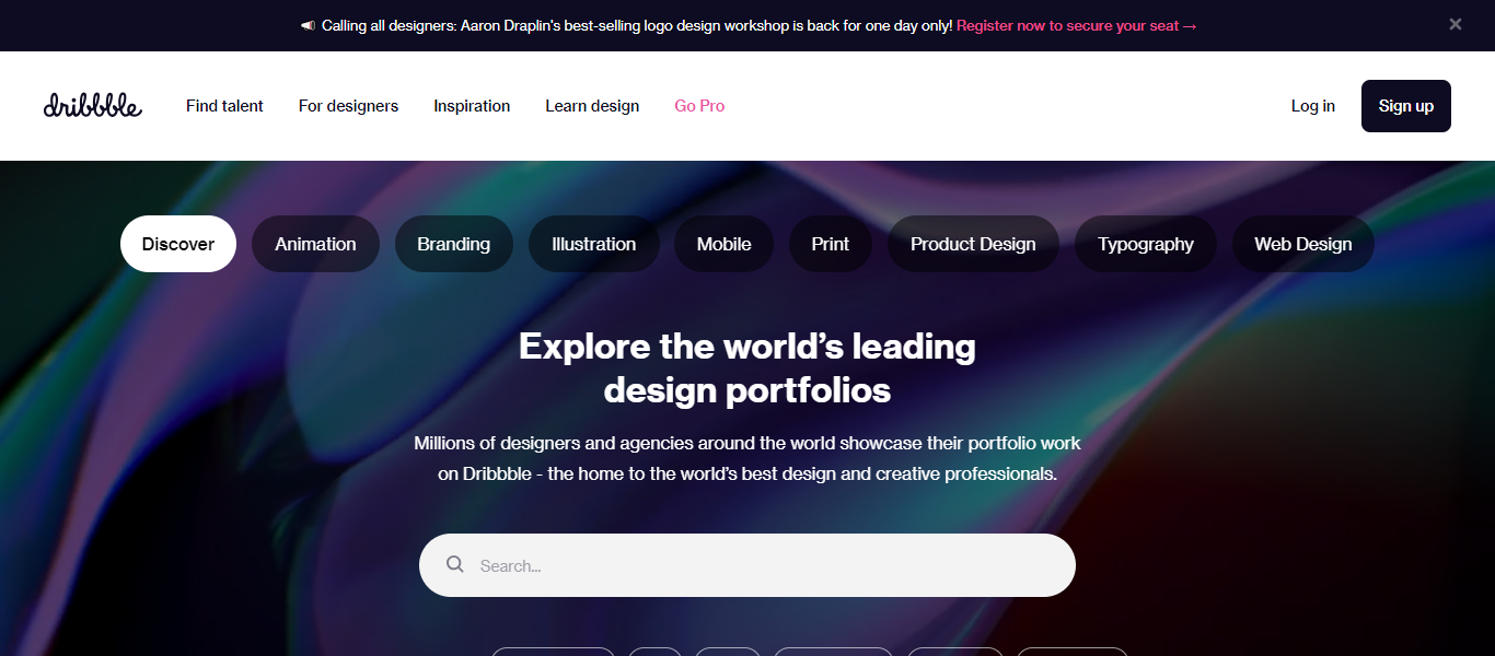
Since it began in 2010, Dribbble — the online community has become one of the most popular places for designers to showcase their work and receive reviews. The invite-only forum serves as a showcase for portfolio projects and individual artistry in web graphics and design for user interfaces, illustrations, animations, and almost all other creative endeavors you can think of.
Even as it is growing exponentially, Dribbble’s website design has a strong sense of community, making it significantly different from Facebook. It’s uncomplicated and real, and this excellently built design platform has several wonderful qualities.
Every page is clear and beautiful, and projects are simple to see and use, thanks to Dribbble’s regular previews. Everything about Dribbble is simple to grasp, locate, and explore right after logging in.
Fat Choy
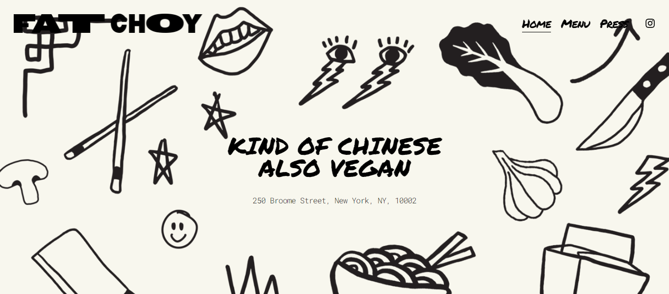
Want to build a website for your café, restaurant, or bar? Fat Choy is the best and most ideal example. I say this because Fat Choy has checked all the right boxes in all the right places. From the moment you go to the main page of this vegan, “kind of Chinese” restaurant in New York City, you can tell how it feels.
Although the Squarespace design is simple, there are easy methods to show off the restaurant’s character, such as the use of a custom-illustrated background and a bold, permanent-marker header typeface in conjunction with a plain Courier body font. Without using any code, a carefully matched gallery of attractive product photos elevates the design.
Grette
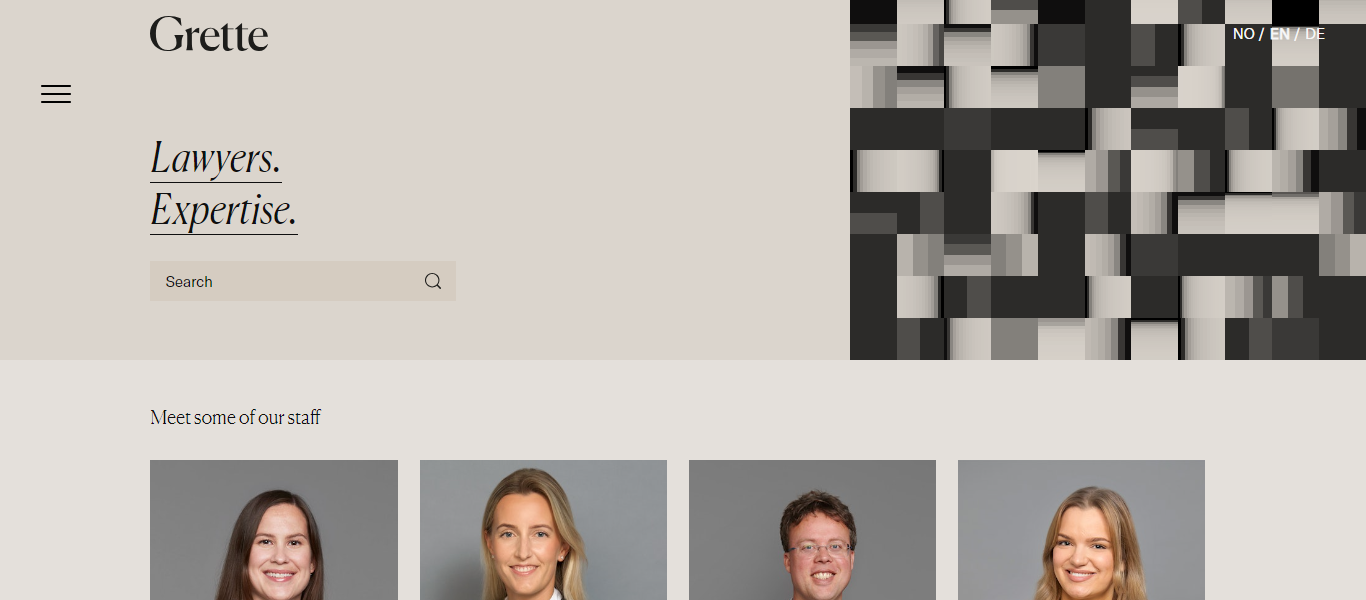
This Norwegian law firm’s website conveys professionalism and experience, but not at the expense of elegance. Visitors are greeted and given a sense of the lawyers’ knowledge in the hero section, which is contemporary in design and has a lot of white space.
A consistent background for team photos keeps the site looking professional, and a variable overlay when you hover over photographs is a pleasant surprise made possible with minimal CSS trickery.
In terms of web design, Grette demonstrates both minimalism and efficiency. Such a website’s design is uncommon, thus making it highly sought-after. Just because the visitors are not inundated with content, this website is not deficient in any manner. Simply put, the information is well-planned and arranged.
Airbnb
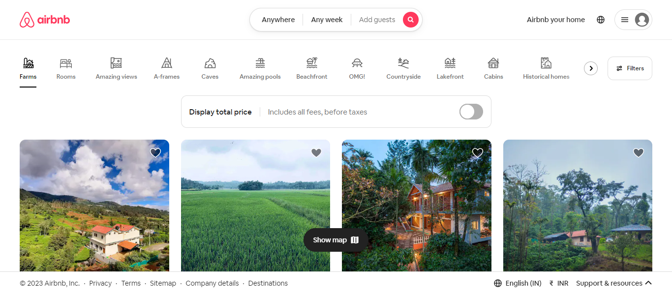
Undoubtedly, Airbnb is the best option for intelligent tourists looking for lodging in a strange location. Every tourist should feel at home, even when using the company’s website. As a result, it has earned a reputation as a useful online location for travelers who want to cut costs and experience local life.
From the white and red color palette to the font, every component of Airbnb’s home page is straightforward. You’ll notice Airbnb’s search bar right away as you arrive at the homepage because it dominates the entire page. The site’s footer includes important connections, such as those to their social media, organized into columns.
Every element of the design, including the icons, calendar, and interactive map, has been carefully considered. The entire presentation is understandable and gives you a thorough explanation of the accommodations.
Conclusion
Although the aforementioned websites have quite different styles, they all adhere to some basic criteria of effective website design, namely, clarity. Although every website should provide visitors with clear, uncomplicated content, not all of them must use a minimalist style.
The first impression that many potential clients or consumers will have of your brand is through your website, which serves as the online face of your company. Be careful to provide a satisfying experience that enables them to obtain the precise information they require and motivates them to take the next action that will advance them through your sales funnel and into your community.


")
")
")