
Last updated - April 8, 2024
Checkout pages are the most critical pages on an e-commerce website. It’s the final step where shoppers complete their purchases, so optimizing the checkout design can greatly impact sales.
In this article, you’ll discover 10 of the most effective checkout page design tactics being used by top retailers today.
Whether you want to upgrade your current checkout or are building a checkout page from scratch, this one’s for you!
Why Optimize Checkout Pages?
Did you know nearly 70% of shopping carts are abandoned at checkout?
The #1 reason is a too-long or complicated checkout process. So optimizing this critical page offers huge potential gains in sales.
Minor changes like tweaking page copy or reducing form fields can lift conversion rates.
However, major changes like introducing guest checkouts or adaptive design across devices can drastically minimize cart abandonment.
Let’s explore some of the latest trends and design ideas you can implement right away to help make more sales.
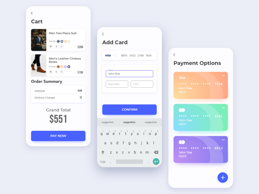
Adaptive Design for Mobile Checkout
Using responsive web design is a must. 58% of web traffic now comes from mobile devices. Yet the majority of stores still don’t optimize properly for mobile checkouts.
Ensure your checkout page automatically resizes across all devices.
Also, display key actionable elements like the payment button above the fold while on mobile so users do not have to scroll.
Some of the top best practices for mobile checkouts include:
- Large buttons that are easy to tap on small screens
- Minimal form fields that can be auto-filled by the browser
- Clear and limited calls to action
- Simplified keyboard input
Remember to test your checkout on mobile devices before launch. Many devices now have different screen shapes or elements like a notch or a fold that can break your checkout page.
Mobile optimization is still one of the biggest quick-win opportunities for most online stores when it comes to reducing cart abandonment.
Personalize the Checkout Experience
Personalization makes the buying journey feel more relevant and enjoyable for each shopper.
When customers log into their user account at checkout, you have an opportunity to greet them personally and use saved details like:
- Default addresses for faster auto-fill
- Previous orders to inspire repurchases
- Payment methods like PayPal for express one-click checkout
Such personalized copy and dynamic elements make the process smoother compared to generic checkouts.
For returning customers, you can even consider a specialized return shopper checkout flow. You can also identify VIP customers and offer exclusive perks or discounts to increase loyalty.
Single Page vs Multi-Page Checkouts
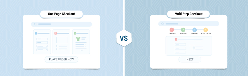
Should your checkout be a single-page or multi-step process?
- Single-page checkouts place everything on one optimized page to reduce friction. Customers can scan all requirements upfront before committing.
- Multi-page checkouts break the process into logical chunks across several pages. This allows dividing longer forms into more manageable sections.
Single-page checkouts have faster completion times but can feel overwhelming if too lengthy. Multi-page checkouts feel more guided but risk higher abandonment across more pages.
Consider your target audience, typical order complexity, and payment methods to determine optimal flow. If possible, keep checkout forms as concise as possible regardless of the checkout flow.
At the end of the day, testing is your best friend in discovering which option converts better for your online store.
Many retailers now use hybrid checkouts starting with single-page simplicity before optional multi-step at payment to capture guest/registered differences.
Real-Time Validation and Error Messaging
Inline form validation provides real-time feedback as customers fill in checkout details. As soon as they complete a field, display an approval indicator or gentle error nudge.
This is commonly done with password fields.
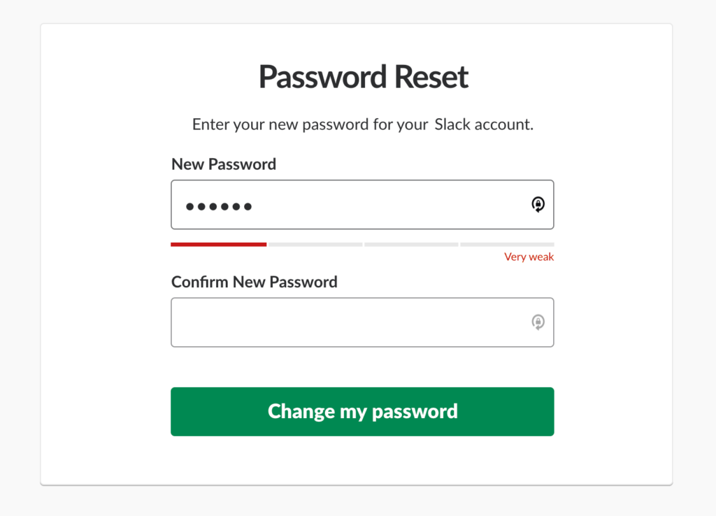
Some major benefits of showing real-time validation or error messages include a reduction in:
- Submission errors
- Incomplete information
- Data corrections
And an overall increase in conversion rates.
Find ways to visually show form errors as close as possible to the relevant field. But keep the language polite and customer-centric—avoid technical jargon in messages.
The idea is to create a smooth, guided progression through checkout.
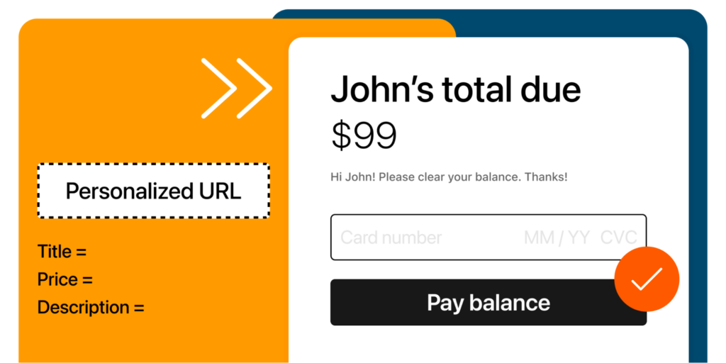
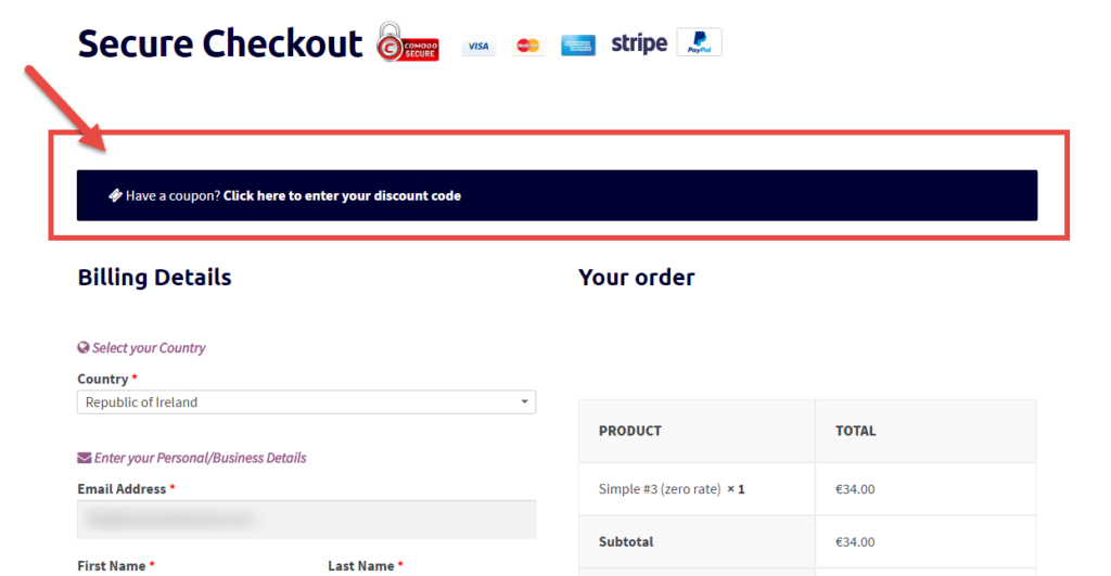
Incorporate Promo Codes and Discounts
Of the surveyed customers, 85% are okay with sharing their email for a discount. This trend is even more prominent with younger generations.
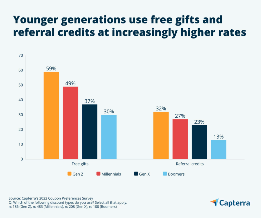
Savvy customers often expect discounts or promo codes to be available at checkout.
So, consider adding:
- A dedicated promo code text field
- A visual list of eligible offers
- Clear link to applicable savings
Sometimes simply displaying “Have a promo code?” with the box to enter is enough. This will tell you if customers engage with the option so you can decide if you want to build more advanced conditional discounting.
You could also show coupons during checkout to surprise customers with additional discounts on the total price they were about to pay.
Timed discounts like “10% off – Next 24 hours only!” add urgency to complete the purchase.
Guest Checkout
Despite the benefits, some shoppers still prefer not to create yet another online account.
Guest checkouts eliminate this barrier by asking for only the essential contact details, allowing anyone to purchase quickly.
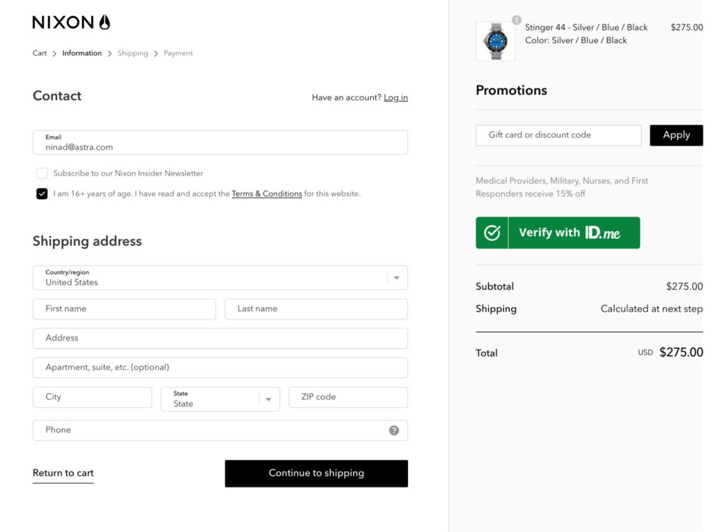
For instance, Nixon Watches lets you checkout without logging in first—essentially giving you a guest checkout experience but also creating your account in the process.
The next time you visit Nixon, you no longer need to re-enter the details.
Guest checkouts remove a major point of friction that often triggers cart abandonment.
Best practices for seamless guest checkout include:
- Make it obvious—“Continue as guest” using simple typography/colors
- Appear directly next to the account creation option
- Only use mandatory fields for contact purposes
- Store past details securely for future guest reorders—or even create their account as part of the guest checkout
Even if you choose not to create the account through the guest checkout process, you can always encourage users to create an account by either giving offers or showing them the benefit of easy tracking, refunds, and future orders.
Remove Distractions
Checkout is the worst time to distract shoppers with external links, unnecessary content, or ads.
Keep focus solely on completing the transaction. This checkout page by Harry’s is a great example of a simple, distraction-free checkout.
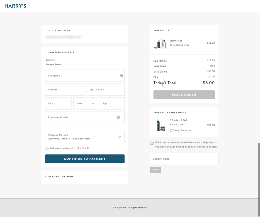
Customers just see the information they need to see—shipping and payment details, products ordered, and shipping dates and charges.
Other common checkout distractions include:
- Unexpected shipping costs or payment requirements
- Hard-to-locate support links if questions arise
- Anything visually that competes for attention
Use crisp, simplified designs that funnel attention deliberately toward calls-to-action like payment buttons.
Follow visual hierarchy principles and draw the eye progressively through key fields and requirements.
Copy should also remain ultra-focused with no vague terminology or unrelated content.
Clean Modern Design
Given increased competition, customers now expect ultra-modern, visually appealing checkouts. You can find many checkout page designs for inspiration on design sites.
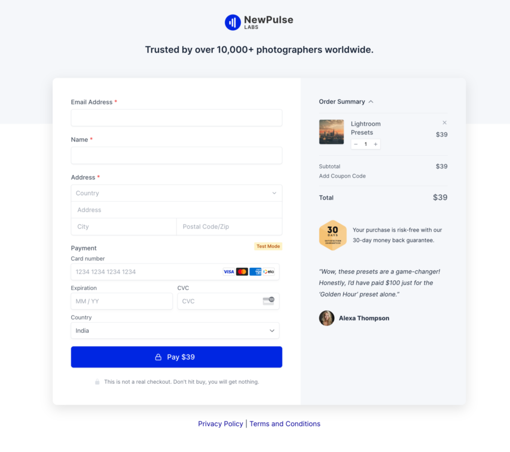
Here’s an example of a good-looking checkout page template available for SureCart. Though function is still a priority for optimizing conversions, clean contemporary aesthetics project confidence and quality—and this is especially valuable if you have a premium product.
Some easy design upgrades include:
- Generous white space
- Subtle color accents
- Flat UI elements
- Quality imagery
- Responsive page layout
Remember that the checkout must continue to reflect your overall brand identity while keeping the interface crisp and uncluttered.
Allow images, videos, animations, and iconography to enhance—not distract from—core components like form fields.
You can also use directional cues, hovers, and micro-interactions to guide users intuitively through each step.
Support for Multiple Payment Methods
Most eCommerce platforms allow you to integrate multiple payment options.
WooCommerce comes with hundreds of extensions, many of which enable a variety of payment gateways. SureCart and CartFlows come pre-integrated with a wide range of payment options.
Apart from accepting cards, also consider the following wallets and payment options:
- Digital wallets like Apple Pay and PayPal
- BNPL financing plans like Affirm or Afterpay
- Localized payment types for international buyers
- Cryptocurrency
- Gift cards
- Bank transfer
Display applicable logos prominently so buyers recognize supported networks.
Optimizing each integration fully ensures seamless, reliable payments. For example, BNPL options may require adjusting checkout flows or order value thresholds.
Upselling and Cross-selling
Upsells and cross-sells suggest complementary products during checkout based on items already in the cart.
Platforms like CartFlows make it easy to implement order bumps, upsells, and personalized customer journeys.
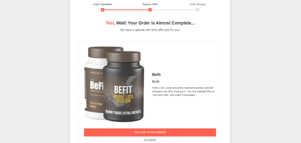
For example, you can upsell higher-tier versions, larger quantities with discounts, accessories often purchased together, etc.
This caters perfectly to impulse purchases and helps raise order values, especially when a customer is in the flow to make a purchase.
Effective opportunities to upsell/cross-sell include:
- Post-cart just before checkout
- Payment confirmation screen
- Confirmation emails
- Thank you pages
Timing is the critical aspect here. Be sensitive not to disrupt an almost complete checkout with ill-timed product pitches and use behavioral and conversion data to identify the best time to pitch products.
BONUS: Trust Signals
Subtly integrate trust signals throughout checkout to reduce hesitations or doubts during purchase consideration.
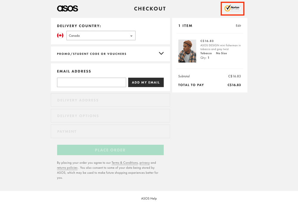
For instance, look at this checkout page by Asos. It has the Norton checkmark which is not too distracting, but also subtly reinforces to the user that their data is safe.
Some examples of trust badges include:
- Secure payment badges
- Safety seals from Norton, McAfee, BBB, etc.
- Customer testimonials
- Visible contact links for support
Even quick trust reassurances like “No spam ever” help buyers feel more comfortable providing email or phone numbers.
Add clear messaging around returns/refunds and satisfaction guarantees before you capture payment. The more perceived trust, the higher the chance customers complete checkout.
Transform Checkout, Transform Sales
Optimizing the online checkout experience is one of the highest-return investments you can make for your eCommerce business. A seamless checkout process pays major dividends through improved conversion rates, larger order values, and greater customer loyalty over their lifetime.
But remember, checkout pages require ongoing optimization and continuous refinement based on how your customers behave. So, this in no way is a set-it-and-forget-it strategy.
Platforms like WooCommerce, SureCart, and CartFlows make it easy to build high-converting checkouts with modern features buyers expect—global payments, multi-step flows, order bumps, hybrid guest/user options, etc with minimal configuration from you.
Whether revamping a legacy checkout or designing an ideal new one, try these strategies to maximize conversions.
Ready to deliver an incredible experience to your shoppers and build a long-lasting relationship that lasts beyond the sale?
Checkout Page Design FAQs
What are some other advanced checkout optimizations?
Let customers check out as guests to skip account creation and prefill address details so they don’t have to type it all. You can also add Apple/Google Pay for faster purchase completion and show progress trackers demonstrating where they’re at. These little things make checkout feel easier and faster.
How can I track checkout conversion performance?
Definitely implement analytics tracking—you want visibility into metrics like add-to-cart rates, completed checkout percentage, average order values, plus drop-off rates at different checkout stages. Set some benchmarks to chart progress over time. And learn where things are getting stuck by seeing which steps have the highest fall-off. That’ll show where improvements will make the biggest impact.
What quick wins provide the biggest checkout improvements?
A few easy wins: Only ask for essential info to reduce field clutter, enable auto-save on address/payment sections to skip repetitive typing, and put prominent trust badges front and center to increase confidence. Small tweaks like these remove friction and hesitation for customers trying to complete their purchases. You’ll likely see the impact in your next monthly report.


")
")
")