Last updated - November 28, 2023
The goal of every campaign you run is to achieve results. However, only three of every 100 visitors to your website will purchase something from it. There is nothing more demotivating than that. Therefore, what are the best ways to persuade prospects to buy more often from you?
Building a well-designed product design page is the key to converting your product or service. The purpose of product pages on your website is to make your visitors take action by designing and providing helpful information.
We’ll look at ten professional landing page examples to inspire you to create your first product landing page that converts.
Components of a Successful Product Page
Before diving into the examples, let’s understand some key components of the product page that help convert.
Copy that Conveys the Benefits of the Product
A product description must be compelling to generate sales. Rather than simply describing the product specifications, explain what it does, who it is intended to serve, and how it solves a problem.
Provide an Easy Way for Customers to Purchase from You
If your customers need help finding where to buy or add your product to their cart, having a product page is pointless. Remember that clarity should precede cleverness in both the copy and the UX. Make sure that visual elements like your e-commerce logo, fonts, and brand colors are easy to identify on the website too.
Using High-Quality Images
Providing customers with high-resolution images of products helps them understand what they are purchasing. Photo images that appear blurry may imply that the product is of inferior quality and should not be trusted. Furthermore, if you offer multiple SKUs (such as multiple colors or sizes), include photos for each option.
Show Social Proof
Customer reviews lend credibility to a product and are an obvious way to do this. These reviews are a popular source of product research for potential customers. Allow customers to leave reviews easily on your page when you create a website so new visitors can see them easily.
Provide the Ability to Zoom In and Out
Many people are interested in details, particularly when it comes to complex or expensive products. That’s why you should allow zoom-in and out options for your products if you come in this category.
Video Explaining Products
Product videos are more engaging than photos and can better help your audience understand your product and why it is superior. You should, however, focus on your best-selling products when making videos since they can be time-consuming and costly.
Product Landing Page Examples for Inspiration
Are you confused about where to begin when creating your product pages? To get inspired, take a look at these page examples. Let’s go!
Recess
Recess has developed a vibrant product landing page to promote its craft mocktails in a can. Using an attractive layout and a catchy banner, the brand immediately captures the attention of its visitors.
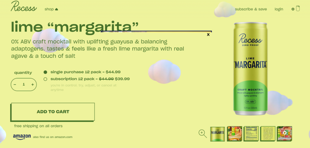
This product page stands out due to its bright colors and bold typography. A unique design and easy navigation add to the appeal of the page. ‘Quick scrollers’ are attracted to the 3D elements shown here. As someone scrolls, the animation is also on point. Visitors will most likely be enticed to try out a product if they see it in action.
What we love about them:
- Make your layout and colors interesting;
- Use 3D elements and animation to make it scroll-stopping;
- Wherever possible, include beautiful images of your products.
Apple
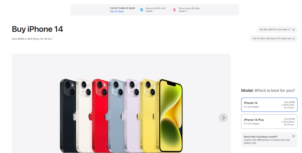
A sleek, minimalist aesthetic is one of Apple’s hallmarks. The design of its product pages is no different. Take a look at the product page for the iPhone 14. There is a clear focus on the product photo in the clean design. Shoppers are directed to make their selections.
There is no need to visit separate pages for each model, color, and storage configuration, Apple provides all the information in one place. Providing a better user experience (UX) and making shopping easier for users.
You will notice that Apple emphasizes the product’s pricing: the company has other landing pages explaining its features and specifications. However, this page aims to attract consumers who are ready to purchase.
In addition to answering questions quickly, the company offers live chat. Assuring that customers do not leave at this crucial point in the process.
What we love about them:
- Whether your users add a product to their basket or select a color, you must guide them to the next step.
- Keep your approach minimalistic and informative;
- Utilize interactive elements to address objections and apprehensions;
- Your landing page should highlight your product.
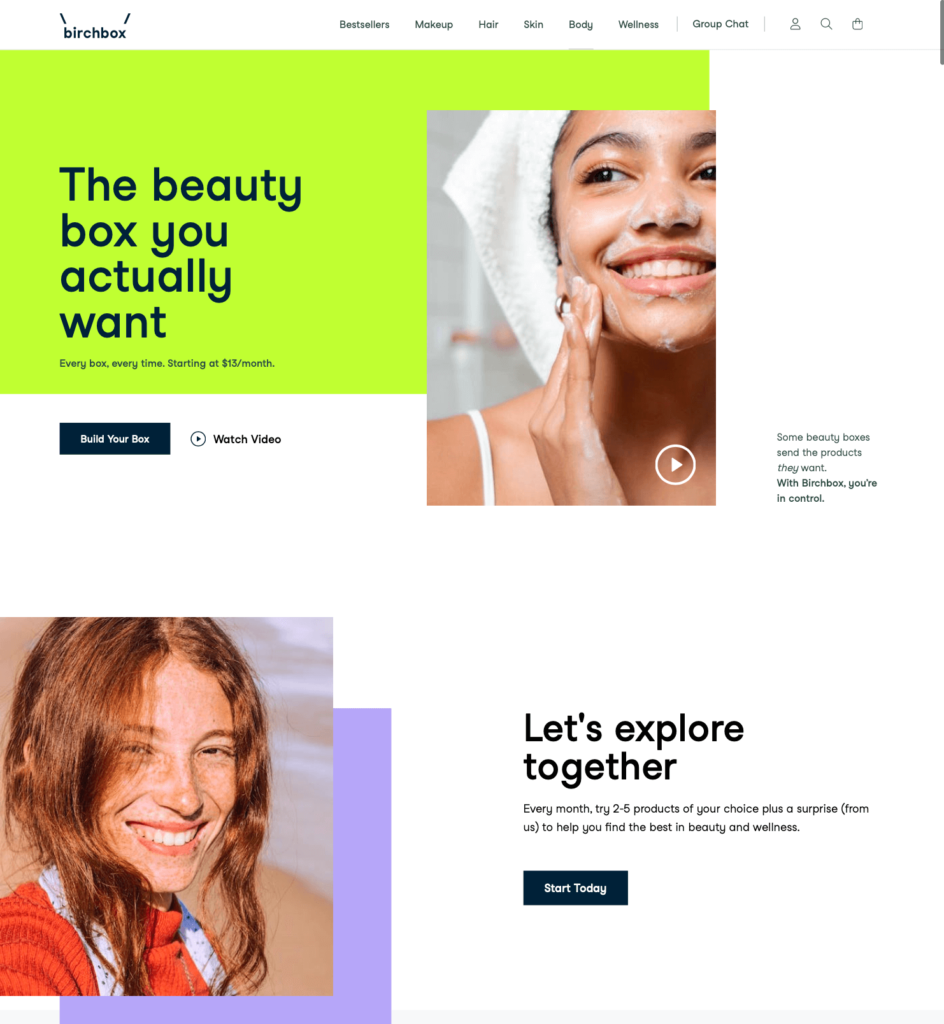
Birchbox
As you can see from the brand’s homepage, a clean design and beautiful imagery make it an attractive landing page template.
With a boxed design and a clean background, Birchbox grabs the audience’s attention. You can make your customers crave your product by providing nudges to ‘start today’ along with clear steps and sections addressing common concerns.
Key Takeaways
- Include a video in the banner at the top of the landing page;
- Contextual CTAs are powerful; never ignore them;
- For better conversion rates, include a section describing what your product does.
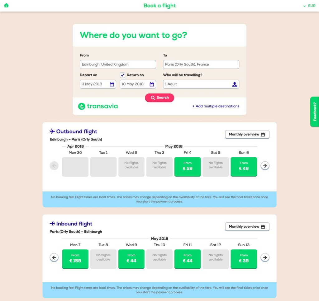
Transavia
As part of the Air France-KLM group, Transavia operates low-cost airlines in the Netherlands. Several best practices for the travel and airline industry can be found on their website.
There is indeed a wide range of websites available on the market; however, Transavia does an excellent job at earning travelers’ trust. Their website uses UX design and clever paths to guide you through the buying process.
E-travel product page
What we love about them:
- As a matter of clarity, they have used a “three-part” structure
- The visual identity of the brand (green and blue) is simple.
- A smart hierarchy of information
- Incorporating TripAdvisor reviews
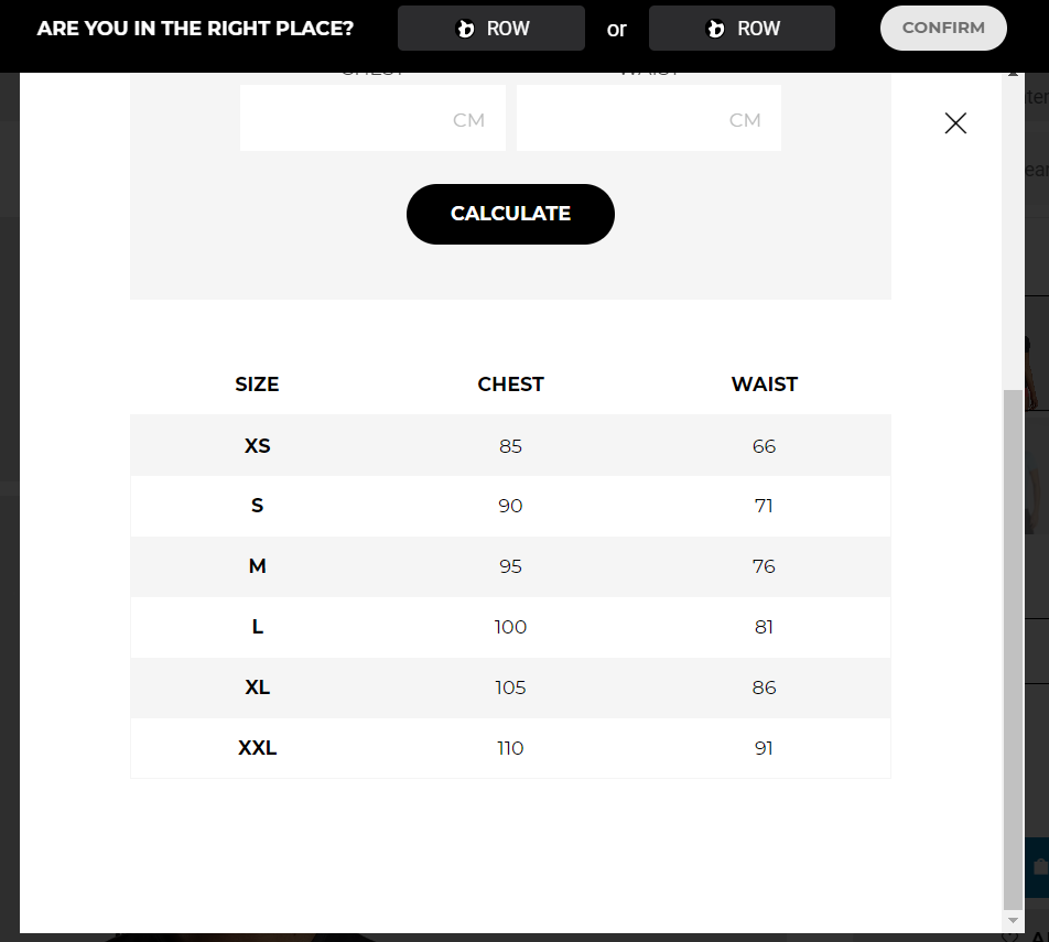
Gymshark
Do you know one of the biggest problems with online fashion shopping? There is no possibility of trying on the outfits. Gymshark offers a variety of model photographs for customers to see what the clothing would look like on them. Assuring that all color variations are covered.
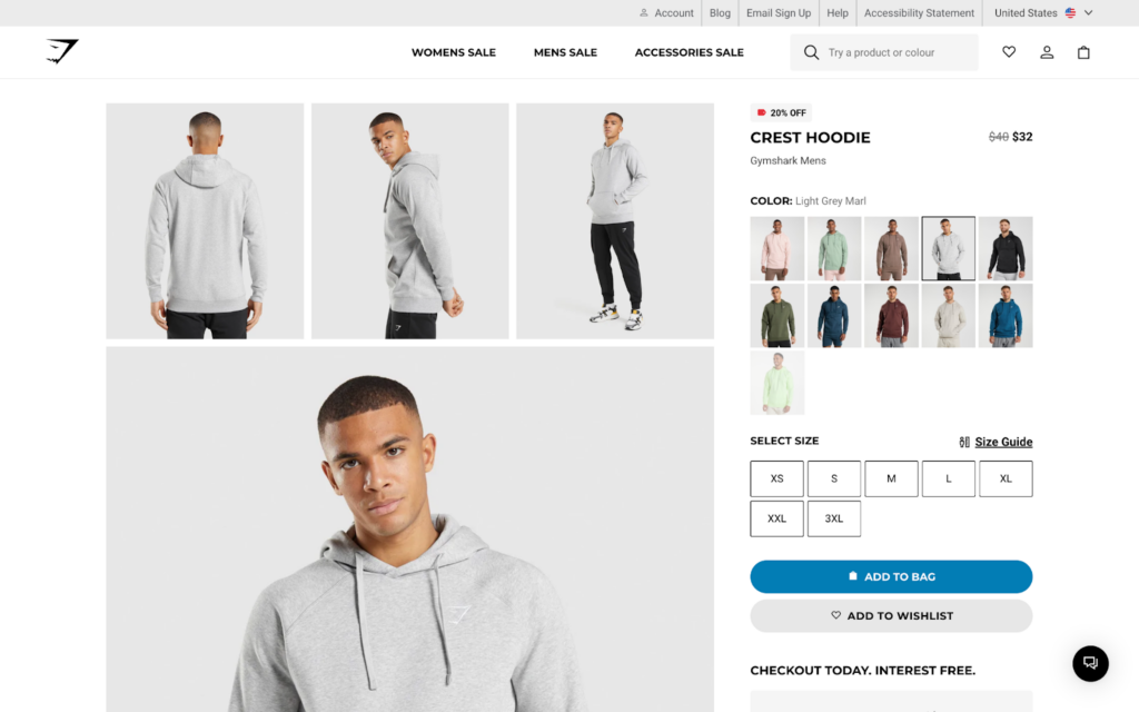
Furthermore, shoppers can find the perfect fit using an interactive size guide.
The most prominent button on this product page is the “Add to Bag” button, but there is also an option to “Add to Wishlist.” This facilitates shortlisting and purchasing items later for shoppers who desire to do so. Consequently, they will be less likely to forget an intriguing topic. A reminder email could even be sent to these users by Gymshark.
What we love about them
- Ensure that your product page contains all the information shoppers may require. Avoid diverting their attention elsewhere and disrupting their journey.
Anova
Cooking enthusiasts will benefit from Anova’s precision cooker. This is clear from the first look at the main product photo. As part of the company’s marketing efforts, they use phrases like “fine dining” and “cooking like a pro” to engage their clients.
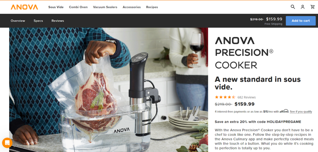
Shoppers can view the product in their kitchen by highlighting features with lifestyle images on the product page. Further, a discount offer is shown using a redeem code that will get more attention from the customer and help in converting.
As users scroll down the page, the “Add to cart” button follows them. Once a user has decided to make a purchase, they do not need to scroll back up.
What we love about them
- You should tailor your product page to meet the needs and desires of your target audience.
- Try adding discount offers to entice the visitor into making a purchase
Boohoo
This Boohoo product page stands out for its prominent price banner. Sales and discounts are a trademark of this online fashion brand. It does not shy away from highlighting them. Pay-later options are also available for budget-conscious consumers. As you see the ‘40% off Menswear’ heading on the top, and as for the current product, it offers ‘25% off for in-app purchases’.
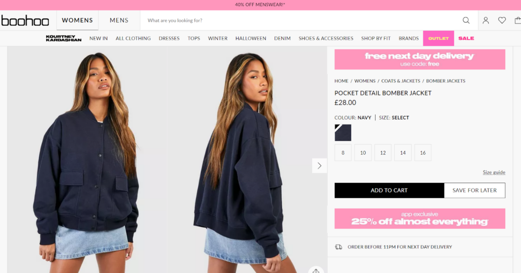
Boohoo invests in high-quality photography of its products despite being a fast-fashion brand with constantly changing stock. Completing the process with modeling in recognition that aesthetics is a priority for the customer. This “Looking for something similar? A section recommends sizes that are out of stock or designs that aren’t quite right—increasing conversion rates.
What we love about them:
- It is important to focus on the most important elements of your product page design when you step back from it
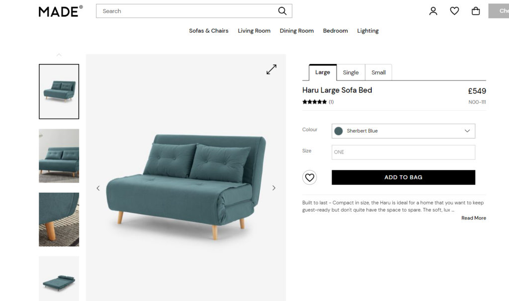
Made.com
A popular British furniture e-commerce site, Made.com offers a unique web-to-store shopping experience and has a bold design aesthetic.
It is evident from the first glance that their visuals seamlessly match their product page. Additionally, they’ve added context-relevant pictures so you can get a better understanding of what the product is all about.
What we love about them:
- Shipping and return policies are clearly stated
- The visuals are stunning
- Comparing sizes
- Video demonstrating the product
- Customer photographs
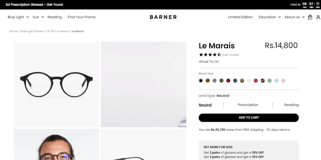
Barner
For shoppers, Barner offers a comprehensive view of its glasses with a variety of product images and an animated GIF.
Following that, shoppers can simulate the in-store experience by using the “Virtual Try On” feature. A creative marketing approach can assist a brand in maximizing sales and reducing returns.
This product page example also uses several interesting upselling techniques:
- Free shipping requires a minimum purchase
- Discounts for multiple purchases
What we love about them:
- Consider in-store shopping and upselling opportunities. Think about how your product website can translate them.
Silver Cross
Purchasing a stroller is a complicated process for expectant parents. The description of this product page attempts to address these questions.
This information appears primarily above the fold (above the fold, before the user scrolls), increasing the chance of capturing the audience’s attention.
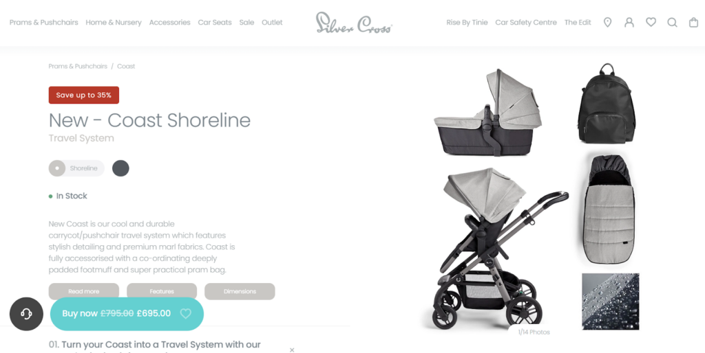
After this, the company directs visitors’ attention to the next step. The “BUY NOW” button is highlighted throughout the page with a high-contrast color.
What we love about them:
- Your product descriptions should address the objections of your audience. Answer any questions they may have before making a purchase.
Conclusion
Having read this article, you can see why product pages are so important. A successful strategy in one industry may not be as successful in another. This is why getting to know your customers and testing various UX designs to determine what is best for your business is so important. Increasing conversions is best achieved by optimizing these pages for your customers.


")
")
")